Not every marketing project is about generating leads, selling a product, or promoting a service.
Sometimes the goal is simply to make people stop and pay attention.
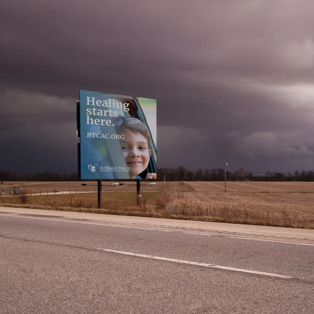
Recently, we had the opportunity to work with Buffalo Trace Children’s Advocacy Center on a billboard campaign designed to raise awareness around child abuse, healing, and the role trusted adults play in a child’s life.
Organizations like Buffalo Trace Children’s Advocacy Center provide critical support for children and families during some of the most difficult moments imaginable. Their work brings together advocacy, forensic interviewing, medical services, counseling, and other resources in a child-focused environment designed to reduce trauma and support healing.
The challenge wasn’t deciding what message to communicate.
The challenge was deciding what not to say.
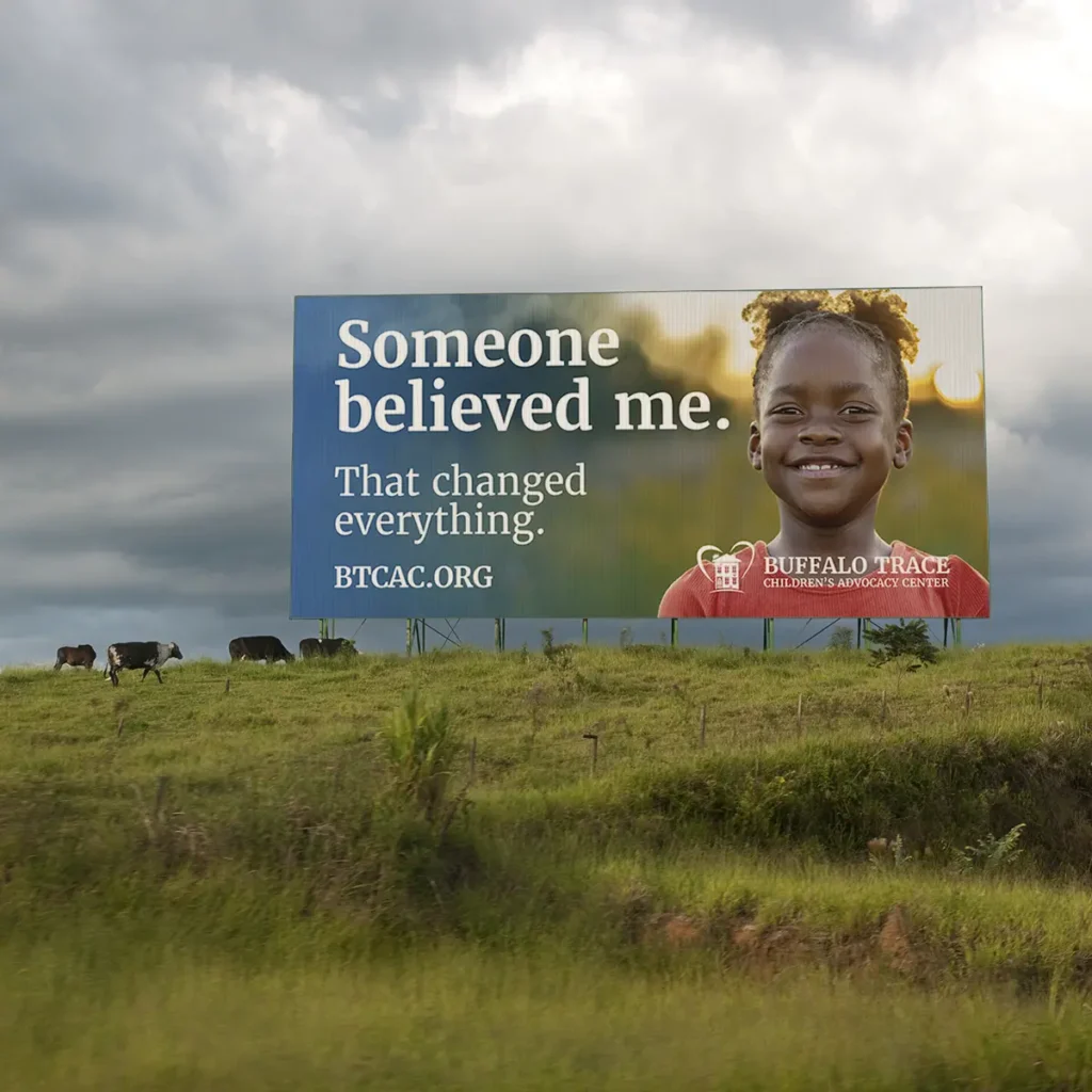
Billboards offer only a few seconds to capture someone’s attention. Unlike a website, brochure, or social media campaign, there isn’t room for detailed explanations, statistics, or long lists of services. Every word has to earn its place.
As we worked through the campaign, we kept coming back to a simple idea: people connect with stories more than information.
The initial concepts included a variety of statistics, educational messaging, and service descriptions. While all of that information is important, we felt the strongest messages were the ones that reflected the impact of the organization’s work through the perspective of a child.
Messages like:
“Someone believed me. That changed everything.”
“Because I was heard, I healed.”
“You can be the safe adult.”
“Healing starts here.”
Each statement is intentionally simple. Together, they tell a larger story about protection, trust, intervention, and recovery.
The visual approach followed the same philosophy.
Rather than relying on overly polished or staged imagery, we wanted the campaign to feel authentic and human. The focus remained on children, expressions, and moments that felt real. We looked for images that conveyed hope and resilience without minimizing the seriousness of the subject matter.
Consistency was also important. While each billboard features a different image and message, the overall campaign was designed to feel connected. The goal was for someone to encounter multiple boards over time and recognize them as part of a larger conversation rather than a collection of unrelated advertisements.
One of the things we appreciate most about projects like this is the opportunity to support organizations that make a meaningful difference in their communities.
Good design doesn’t always need to be loud. Sometimes its job is simply to create enough space for an important message to be heard.
We’re grateful to Buffalo Trace Children’s Advocacy Center for the work they do every day and for allowing us to play a small role in helping share their story.